Creating Spider-Man: Across the Spider-Verse with Nuke, Mari & Katana
How Sony Pictures Imageworks built a unique visual style
With a nomination for Best Animated Film at the 2024 Oscars, four wins at the VES Awards, and numerous other accolades, Spider-Man: Across the Spider-Verse has redefined what’s possible in animation.
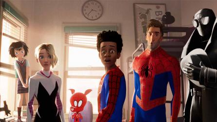
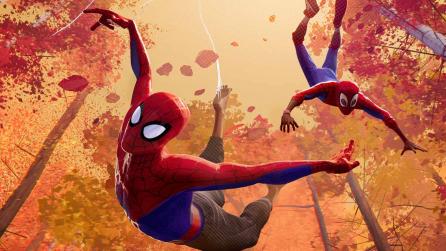
For the film’s predecessor, Spider-Man: Into the Spider-Verse, Sony Pictures Imageworks completely reinvented its approach to Look Development, lighting, and texturing to reflect the comic book origins of the story. Building on this visual style, Across the Spider-Verse is set 18 months after the previous film, with the Imageworks team using Nuke, Mari, and Katana to bring new environments to life, from Gwen’s world to the city of Mumbattan. Much of the concept art was inspired by the vintage Spider-Man comic of the ‘70s.
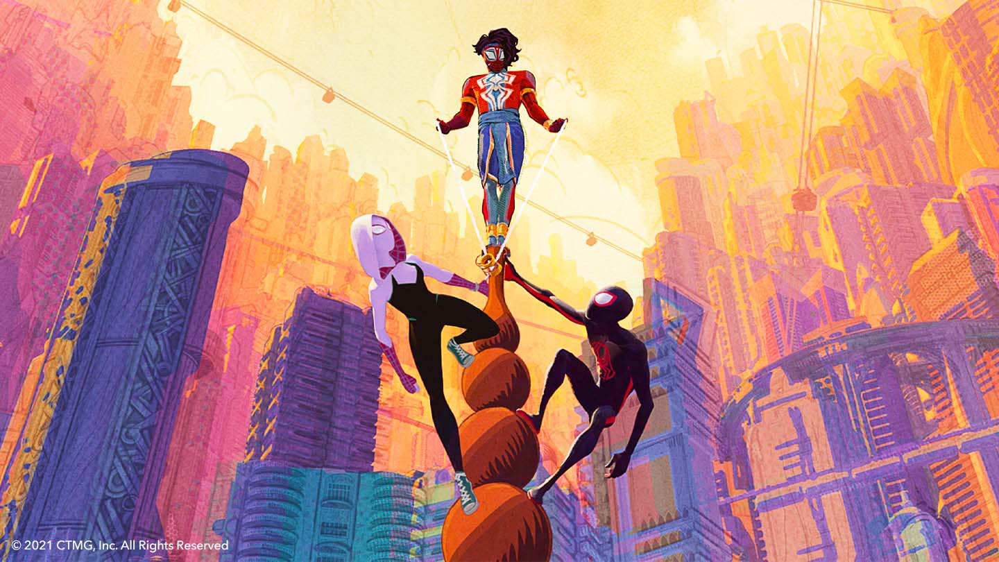
Across the Spider-Verse differs from traditional animated films, where most of the work tends to be done during the lighting phase, with limited work in compositing. On this project, a totally different approach was needed to transform the concept art into the final design.
“The final look of the Spider-Verse required a careful balance between texturing, lighting, effects, and compositing,” explains Marco Recuay, Head of Compositing at Sony Pictures Imageworks.
Painting new worlds in the Spider-Verse
The film’s distinctive style meant that the team had many key problems to solve, with brush strokes proving to be the project’s biggest challenge. The team built on early tests with Imageworks’ Brush Bomber tool, an Open Shading Language (OSL) node in Katana, porting the tool to Nuke BlinkScripts to take advantage of the native GPU support. This enabled them to render 45 layers of brushes with multiple frames per second.
They then added animation support so that the brushes would feel less ‘stuck on’. All of this development was completed in BlinkScripts, before the project was handed over to the Nuke dev team, who built a C++ version in the Nuke Development Kit (NDK).
“The NDK nodes work better at large scale for us on our render farm, where we have thousands of machines rendering,” explains Marco.
This gave the team a way to paint within the lines using an interactive tool within Nuke. However, they still needed a way for the strokes to extend beyond boundaries, so they started experimenting with ways of dynamically attaching brushes to geometry. As a result, they developed the Stroke System, a collection of more than 40 individual nodes that were used for most of the brushing on the project. Offering more flexibility, this modular system enables data to be passed between nodes so that using the same input data, you can arrive at dramatically different looks.
“As the Stroke System became capable of recreating more and more looks, we were able to replace more expensive 3D render techniques with a comp solution that could be updated interactively,” says Marco.
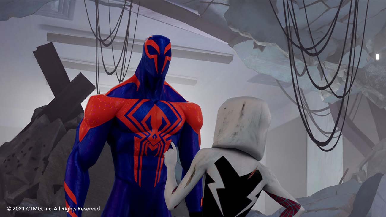
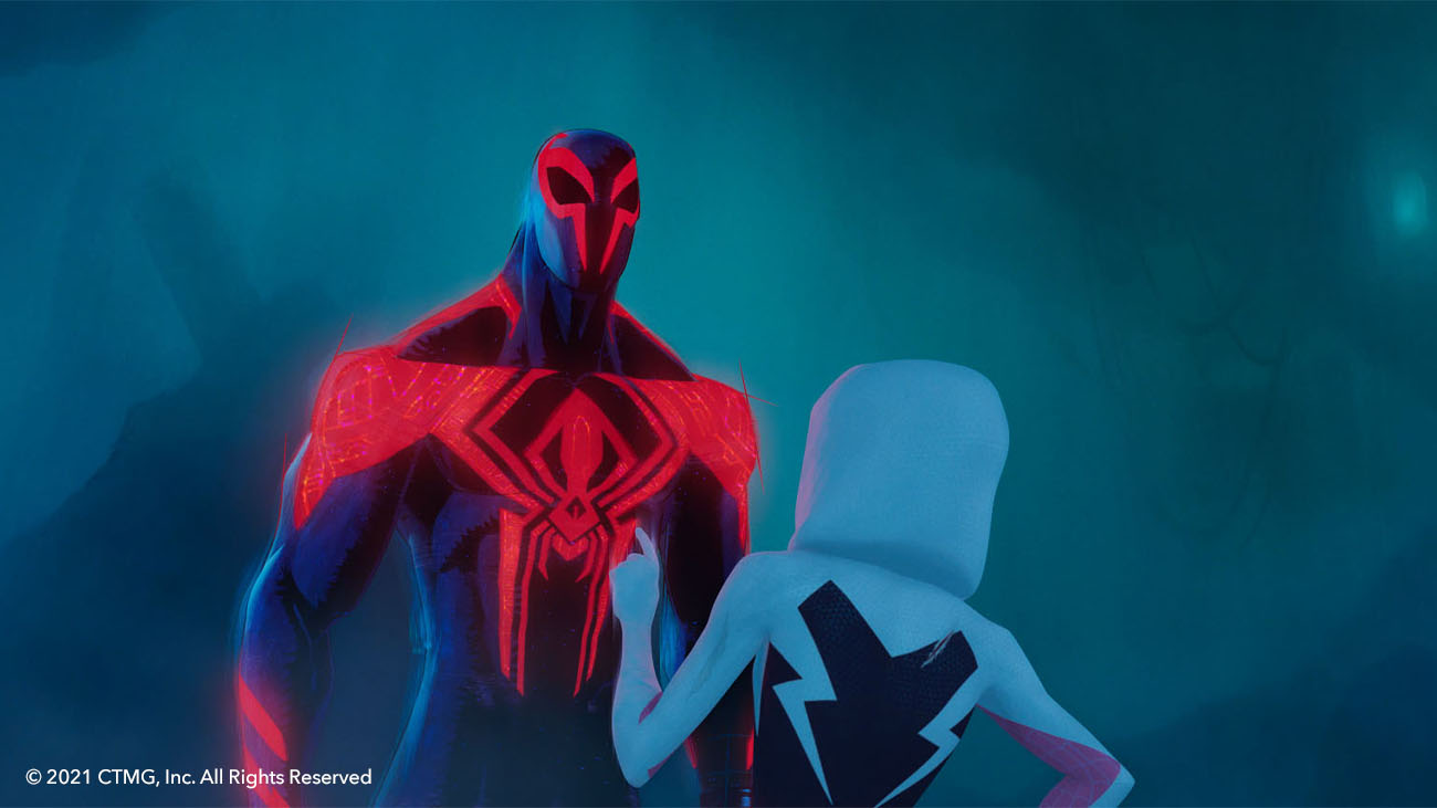
To capture the hand-painted look, the artists used Imageworks’ hair system for stroke distribution, combined with custom OSL tools for sampling and rendering to create some tests. This was used in several early shots for Gwen’s world and to render the painted highlights of Miguel's suit. For Miguel's face, the team drew curves using an early version of the Nuke tool, then rigged them to the model and rendered it in Katana, using their OSL tools. This Curve System was built to be modular after the team saw how successful this approach was for the Stroke System.
Building the ink lines of Mumbattan
For creating Mumbattan, based on the vibrant culture of Mumbai merged with the modernism of Manhattan, the artists took inspiration from 1970s comics, including everything from pulpy paper stock to printing misalignments. The simplified color palette meant that most of the detail would be conveyed through ink lines. As a result, the team developed an innovative procedural drawing tool called Kismet, giving artists the ability to control ink outlines.
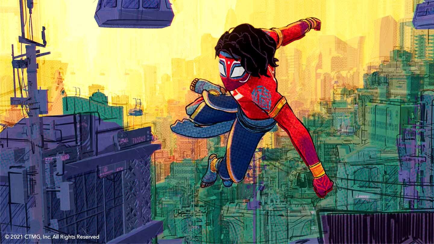
“They could make ink lines sketchy and loose, extending past the edges of objects, and adapt them to the line styles necessary for the different looks,” explains Marco.
Bringing traditional print comics to the big screen
While color mapping in Nuke, the team also built a new separator tool for the film to mimic the CMYK printing process, including misregistration issues and distortions. However, simulating a traditional printed format on screen meant that the team quickly ran into the issue of additive versus subtractive color.
Traditional compositing operations are additive — adding red, green, and blue gives you white. For paint and ink, it’s the opposite — combining the primary colors produces black, so instead, subtractive color uses cyan, magenta, and yellow as its primaries.
To stop the additive system biasing outputs towards white, the team created a new PigmentMerge node to properly map the correct color results while working with the RGB system within Nuke. This was one of many different BlinkScript nodes, which were used extensively throughout the project.
“Not only did we use BlinkScript for prototyping nodes that eventually were converted to C++, but a lot of our final production tools remained in BlinksScript because the native support for GPU acceleration meant user interactivity remained high,” explains Marco.
Ink hatching as lighting: a multi-department approach
Another key aspect of the Spider-Verse was ink hatching, where hand-drawn lines are used to add shading to a drawing. In Miles’ world, the team used hatching as a light effect, with hatch lines used to build shadows. They built several hatching tools that could run interactively in Nuke.
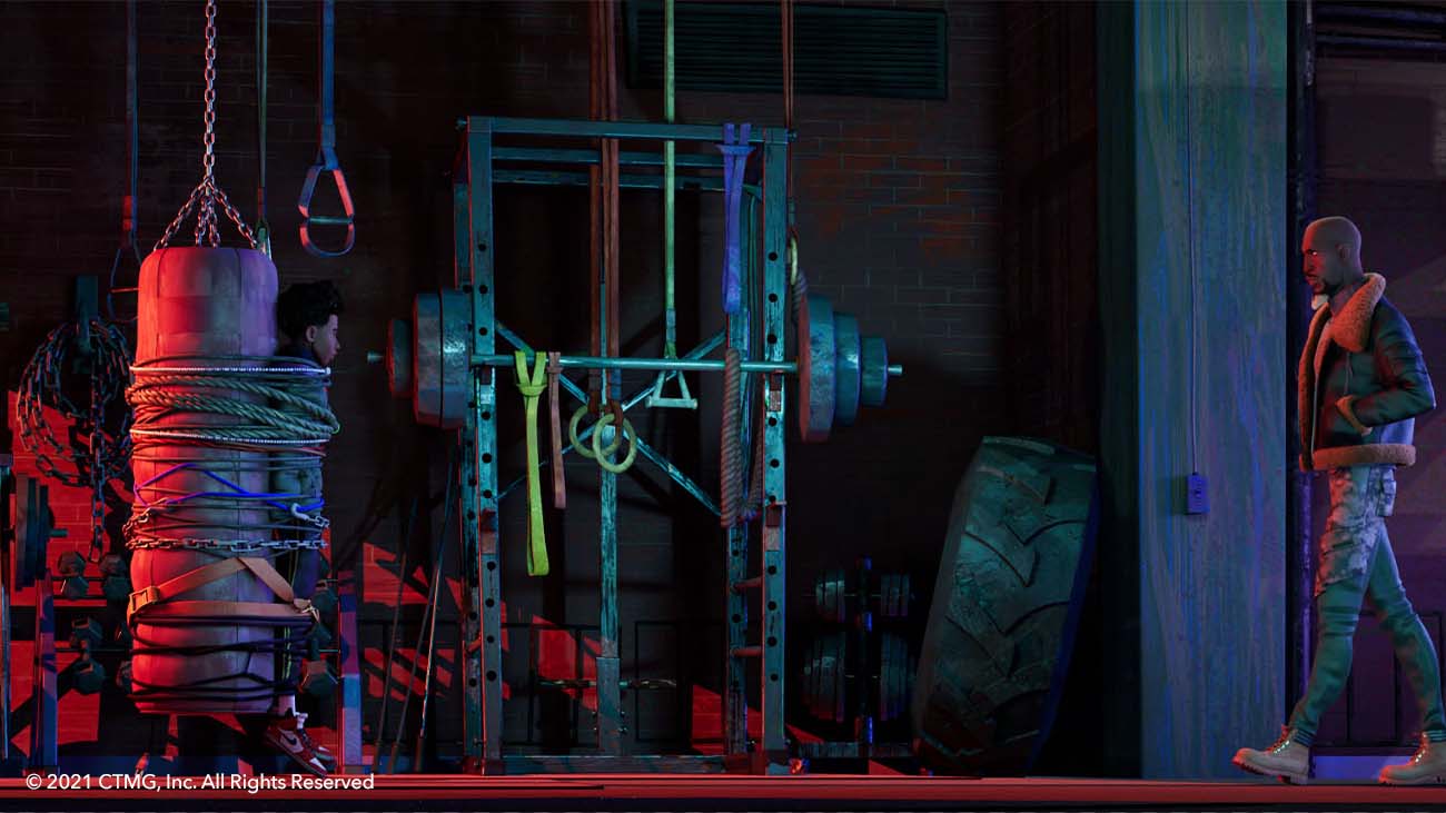
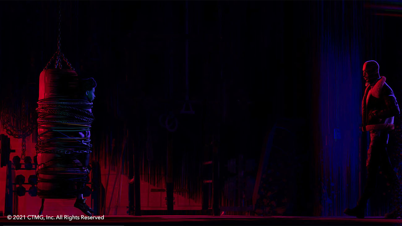
However, on this project, the ink hatching was particularly complex as it often became part of the characters themselves. For Ben Reilly, or Scarlet Spider, his concept art had hatching lines that changed directions with the curvature of his muscles.
“This couldn't be just a texture solution as it needed to react to both lighting and his movement and deformations,” says Marco. “The answer was a multi-department collaboration with texture artists painting custom flow maps in Mari, which were passed to lighters to produce special occlusion in fresnel maps out of Katana. All these maps were handed off to Comp, using our custom gradient hatching tools to drive the final ink hatching.”
Creating The Spot
Another key challenge on the project was reproducing the flowing watercolors, dripping paint, and bleeding inks from traditional print comics. This was especially important for creating supervillain The Spot, a character that comprises a collection of sketchy pencil lines, white acrylic paint, and lots and lots of ink spots all over his body, which he uses to express himself.
The team passed brush strokes through the Rebelle paint simulator, which enables artists to control the wetness, gravity, and absorption of digital paint strokes to generate elements for Comp to layer into scenes. To augment this, the team created a Nuke tool called MaskToInk that enabled artists to render a simple mask as if it were made of wet ink.
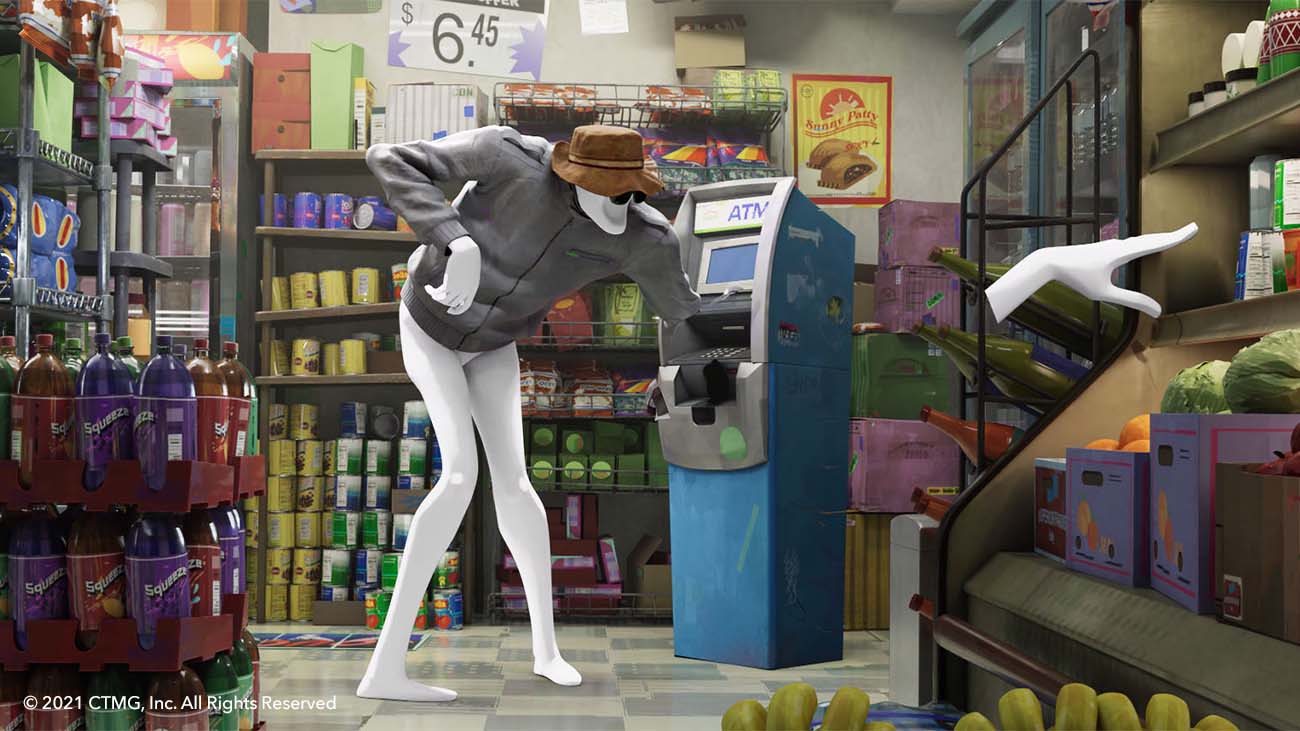
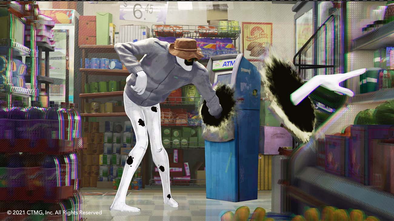
“The tool had mappable controls for where and how much ink should spread, based on how wet or dry the surface is,” explains Marco. “Nuke is great for experimental look development like this because even a very complicated setup can be wrapped up into a more simplified node user interface, with custom controls for the artist to use, rather than a large complicated template to learn.”
Constant innovation in the Spider-Verse
With its continuing development of non-photoreal tools over the last five years, Imageworks has now grown its Nuke toolset to more than 100 individual nodes and tools. The examples above offer a glimpse of how the team created the distinctive visual style of Across the Spider-Verse, and how Nuke, Mari, and Katana enabled that continual innovation.
“We were developing the entire time,“ says Marco. “Every day, an artist would come up with a new idea, or a new way of using the tools. The creative team had the freedom to be imaginative, to push the boundaries, and explore ideas that had never been done before.”
